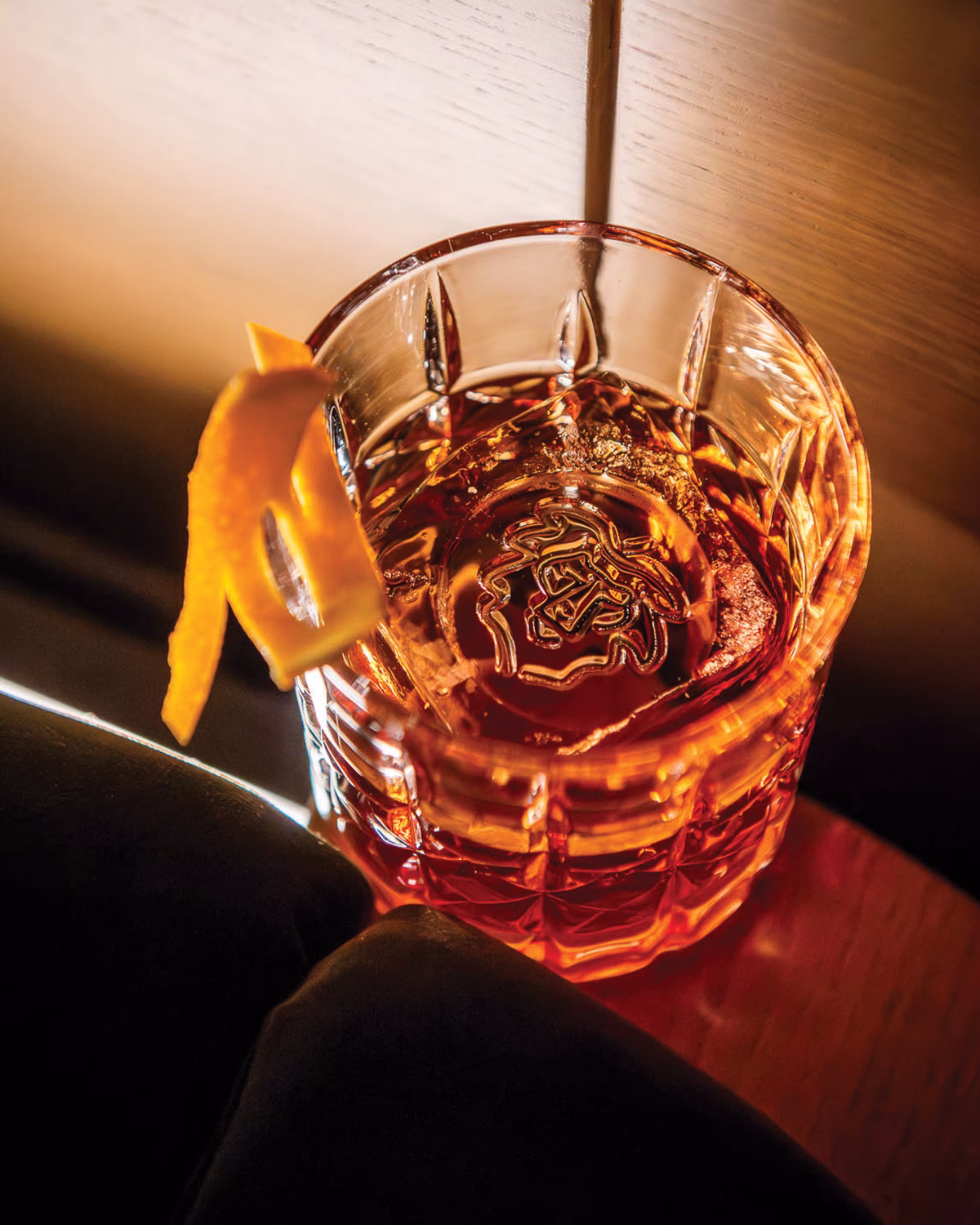
The logo design is playful, featuring an elongated ‘O’ that mimics a lion’s roar. The lion illustration incorporates an accent aigu as its mane, mirroring the accent on the é in Léo.
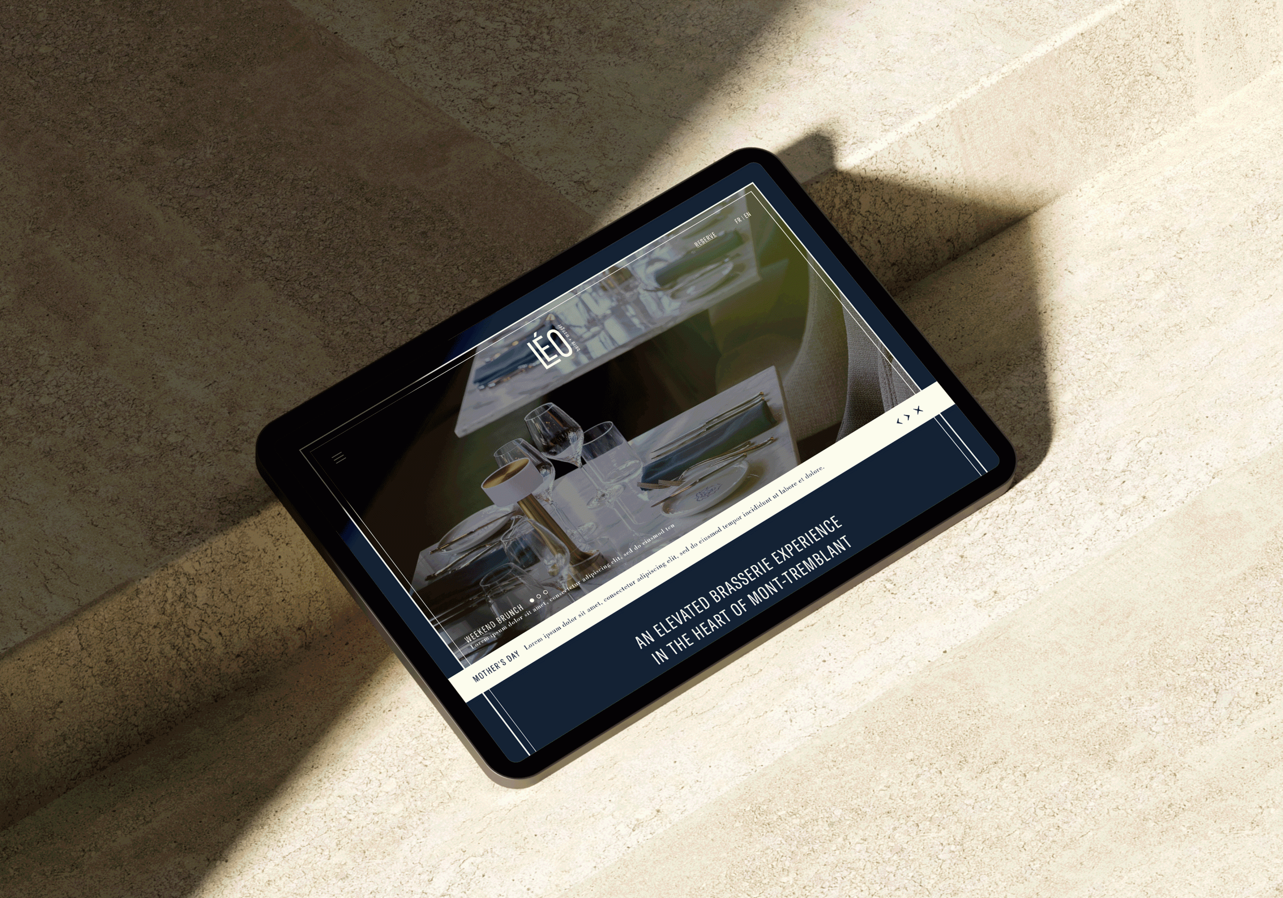
Playful illustrations reflect the family-friendly vibe. Clean sans-serif headers pair with classic serif body text, highlighting the blend of classic Québécois cuisine and modern flair.
The website interface features clear calls to action to ensure guests can easily find the section of the menu they’re trying to navigate.